Kit Oisín King
Artist Statement
Kit King is a multidisciplinary word artist with a practice inspired by DIY and maker culture. King takes a problem-solving approach to making, using an ever-expanding skillset to realise his blue-sky ideas. It is through this act of craft that he finds meaning in the work, allowing the process to guide his thinking instead of using art as a platform for his own presuppositions.King often works semi-anonymously in public, side-stepping the gallery system to distribute his art directly to the community. He aims to promote mindful engagement with the world, placing value on play and the creativity of others.
Reflective Statement
The main critiques of my work last semester were that it was too scattered and I hadn’t truly engaged with any of the media I was using. This has been a repeated issue in my two years on the course – I have a tendency to anxiously overproduce out of a need to “catch up” that makes me favour smaller, quicker pieces and flit around between many different media. I believe this semester these problems have truly been addressed: I produced fewer, but more complicated works, using my wide-ranging skillset to explore my love for printmaking and the repeated image.Reading the journals of Keith Haring was a big turning point in my artistic development. We are similarly populist artists, sharing scepticism of institutions and favouring public work. With such close starting points the divergence in our practice became clearer and the ways in which I was failing more pronounced, such as Haring’s mode of experimentation; treating “finished” pieces as objects that he could use in further work rather than closed cases. A major constraint on my practice this year was being financially unable to produce more work, but this inspired me to go further with the pieces I already had, resulting in complex, multi-staged projects like my Dare cards, and fresh life given to older pieces such as my neon sign.One of these resurrected works was my Metro Poetry project. I was never quite satisfied with the outcome I had last semester – there had been a lot of issues with the prints I produced and I never reached the point of distribution. The design itself contained a lot of fine lines that the technicians told me were “technically printable but unlikely to work”. We thought of a slight workaround where I had two identical screens, printing once then exchanging so it could be washed. However, I worked on my technique until I could produce a large volume of my prints without needing to change screens, a dramatic improvement on last semester where I experienced freezing on even the larger versions.After crossing that Rubicon I became enamoured with printmaking. I produced large-scale prints with a similar level of detail, found different ways of distributing my work, and made prints collaboratively with Ross Lynas. The Dare cards were another development, playing with scale, colour, and bringing in letterpress and thermography. I felt as though I truly understood the medium; what I was doing with each action instead of just going through the motions. The Art Machine was the culmination of all this, almost brattishly illustrating my understanding of the process by designing a machine that could perform it. I am a little disappointed with the outcome. It’s messy, unpolished, and though it functions, it is not reliable enough to the point where I could have it interactive in the gallery space as I had hoped. My intention is to treat this iteration of The Art Machine as a prototype, and create a more refined version informed by this experience.Even in its current state, The Art Machine is possibly the best thing I’ve ever made. I had produced one piece in the wood workshop before, at the start of second year (it didn’t stand up), yet found myself spending weeks in there making both of my degree show pieces. I am immensely proud of both, regardless of their imperfections.My interest in woodworking was kicked off by teaching myself how to make canvas stretchers in my Trafford studio. It felt satisfying and oddly exciting to learn this skill, and I pretty rapidly started coming up with ideas to push myself and my abilities. Woodworking makes sense to me. I often struggle with connecting to the formal and material in my art – my preoccupation is with cultural theory and I am very scientific in my approach – but much like with printmaking I am beginning to understand the medium in a way that allows me to test the limits of what I can do.This semester I’ve realised my love for DIY and maker culture, and how much that informs my practice. There is a running thread of scepticism towards institutions in my art: from setting up my own workshop and distributing pieces in public, to my gallery practice, which generally plants itself in opposition to the space (this is true of my Manchester Art Gallery installation from Unit X last year, The Art Machine, and my Vertical Gallery commission). This is another face of my populism, and while I am truly passionate about the decentralisation of art, I have to be careful to not allow it to slip into anti-intellectualism.Setting up my workshop was part of this shift towards DIY practice. I needed to create a space for my peers to use after they graduate and lose access to the art school facilities, and it has become a truly nurturing community hub. Ross Lynas has already moved in and we intend to do more work collectively along with our friend Ava, a photographer and videographer.The exhibition I organised with Ross this semester served as the blueprint for our future projects. After discussing our mutual interests and experiences we devised a theme, then selected existing works and pitched new ones that would fit. Some of these were collaborative and co-worked efforts, such as the rat screenprints that I made out of Ross’s photographs, or the masks that we made side-by-side with the same materials. Ava documented our working process on camera, and photographed the exhibition alongside two other friends who were using film (we are yet to see the developed photos).Unfortunately, we were both at capacity with our degree show work and unable to work on the exhibition for around two months. With all other pieces for the show completed, the only roadblock was the photoshoot featuring the rat masks. We were able to pull someone aside briefly to take some photos in the ginnel, which I edited, used to make a poster, then wrote an exhibition text with Ross’s input. I wish we’d devoted more time to this photoshoot. A big influence on this exhibition was Marcus Coates, whose costume work is about physical animal embodiment – we could have pushed it further and shown respect for rats by ‘becoming’ them rather than anthropomorphising them.Regardless of the rush finish, I am delighted with how the event went. We worked to naturalise our work in the space, wheatpasting our art onto the red bricks and incorporating items scavenged from the alley into the exhibition. Attendance was good in spite of having very little time or energy to advertise, and the feedback we received showed an understanding of the themes and messaging.My collaborative relationship with Cass Jones on Fine Art and Art History has also been a positive development this semester. There is so much overlap in our approaches that working together is always seamless, and we are able to produce a great deal of work very efficiently. Having produced two works in our collaborative series (the second being a commission for the Vertical Gallery in the Holden), we hope to expand the project further and get Polari into more art galleries.Overall I would say my practice has become more mindful, echoing emergent themes in my work like the Dare cards. This development was actually inspired by my foray into analogue photography. While I may not have produced much work in the medium, the limitation of the number of exposures on an expensive reel of film made me properly consider each shot, waiting for the perfect moment. I extrapolated this into the rest of my practice, not jumping on every impulse and whim, and waiting for the ideas that resonated. Learning how to operate a film camera with older lenses also helped progress my understanding of photography in general, giving physical shape to settings that are alien words and numbers on a digital camera. My photography visibly improved between my first round of Dare card photos and the second as I grew better at using the only lenses available to me (an old foggy macro zoom from a junk bundle, and an extreme wide angle astrophotography lens).The second round of photos took place on the Thursday of installing the degree show. As I previously mentioned I experienced financial struggles this semester: I had no money in the run-up to Easter, then as soon as the maintenance loan came in I lost both my phone and bank card. This meant I had no way of being on location and getting the shots. My card arrived on the Thursday and I spent the full day travelling around Manchester getting the 14 photos left on my list (god bless Dayrider tickets), which I edited and compiled into a book overnight. The book was also a last minute decision after discussing my setup with Adam and Dave, axing the map I’d designed in favour of something more intimate and expository to the work. This was my first attempt at bookbinding and given more time I would have liked to try out thicker paper to limit warping and looked into adding a cover.Given the circumstances surrounding it, I am really happy with my degree show work. There are definitely things I would change – the message on the back of the Dare cards is a hangover from before I adjusted my writing style at Adam’s suggestion and both pieces are a little messy – but overall I believe I have created some high quality, sophisticated pieces, particularly for an undergraduate artist with minimal experience compared to most of my peers.Both of my degree show pieces feel like a reflection of my time in Manchester as I prepare to leave university, six years after I came here to study astrophysics. The work I’m producing pays homage to my scientific background and feels imbedded in the culture around it, as well as being playful, inventive, and toyetic. I have established a workshop and fostered a community around it brimming with motivation to build things from the ground up. This website will be repurposed as my professional portfolio, and I intend to sustain my practice through part-time work, ideally in an art setting. I will continue to volunteer at Manchester Art Gallery and have just been accepted as a volunteer at the Whitworth, which will strengthen my gallery experience and serve as my continued connection to art institutions while my practice is DIY-focused.
Projects
Projects
The art Machine
A gear-operated self-inking printing machine that combines woodworking, laser cut perspex and MDF, 3D printed parts, ball bearings, ink, lino-carving, and receipt paper.So that you don't have to.
[Click to expand images]


Machine - 600 x 400 x 400mm
table - 1000 x 600 x 750mmThe Art Machine started out as an extension of my exploration into the repeated image. I am fascinated by the imperfections and texture of analogue prints, and have done similar experiments before by hand printing small lino pieces in rows to fill a large page. I find it fascinating how the same process can illicit a slightly different result each time, drawing attention to the labour and meaning you have to look at each one to get the full image.This piece is now a rumination on my relationship with art, reflecting on my own issues with overproduction while also satirising ai and jargonistic art writing. The text itself is written to be cohesive but meaningless. There are mismatched adjectives and nouns, oxymorons, and buzzwords throughout, partially inspired by asking chat gpt to write me a "short, fashionable artist statement".Due to financial constraints I was unable to replace parts or make more polished versions, requiring a lot of troubleshooting and problem solving. The biggest issue was lack of pressure between stamp wheel and print bed. I weighed the wheel down by filling it with hundreds of carbon steel ball bearings, used a metal dowel to prevent warping, and added a wooden block under the print bed to keep it in place. The Machine functions, though not consistently enough to have it set up as an interactive or demonstration piece. Instead I took the best print made by the machine and threaded it through in the gallery space, and am really happy with the overall effect as a static sculpture.
Projects
Dares
Cards - Screenprint, lasercut, letterpress, thermography, and collage on Gmund Hampf 300GSM paper. 150 x 80mm each.Frame - Wood, 3mm perspex, paint. 1138 x 738 x 44mm.Book - Parch Marque 100gsm paper, inkjet prints on cartridge paper, embroidery floss. 210 x 148.5 x 10mm.Scroll down for further information and installation images.
[click the arrows to flip the cards]
This was an incredibly ambitious and satisfying project, bringing together various printmaking and CAM techniques into a polished piece of product design. as standalone objects these needed to present as a high quality item so that members of the public wouldn't treat them as throwaway, while Print irregularities and the collaged dares grounded them in the handmade and drew attention to the labour. An issue with my manufacturing process was the lack of room for error - two cards being damaged in the letterpress meant I had to remake an entire set, though this provided me with a large number of spares to trial different options for the reverse sides.the larger design created by bringing the cards together is used to hint at something more beyond the individual, while also playing into the idea of the unactionable game. my original draft of the dares was far more grounded in reality, somewhat saccharine, and lacked a defined writing voice. These aim to translate my way of engaging with the world into a more poetic form, encouraging people to think in a similar way to me instead of dictating their actions to them.
[Click to expand images]
Public Distribution


The Locations

When deciding where to hide these cards, I tried to make them location specific, choosing spots that matched the dares. Some are more generally relevant: "build a life out of bus tickets" at the transport museum, for example.Others are places of personal resonance. I was really caught off guard by what an emotional experience placing the cards would be, as I found myself retracing the last six years of my life, marking each spot with how I spent it there.What began as an attempt to shape the culture of the city through interactive art turned into an outpouring of love for Manchester and the ways in which it shaped me. I channelled this feeling into my degree show setup, changing it at the last minute from a large map to a photobook that better reflected the intimacy of the project.
Gallery installation


SuperpositionI was first observed on oxford road
Wave collapsing on a sudden shore
A cat on the brink given Time
and placeMake me in your image
and I’ll be your reflection
Let you fix your hair in mine
While we giggle at the stainsYou saved it And I spent it
You shaped it and I’ll share it
Infinite potential
here and now
Projects
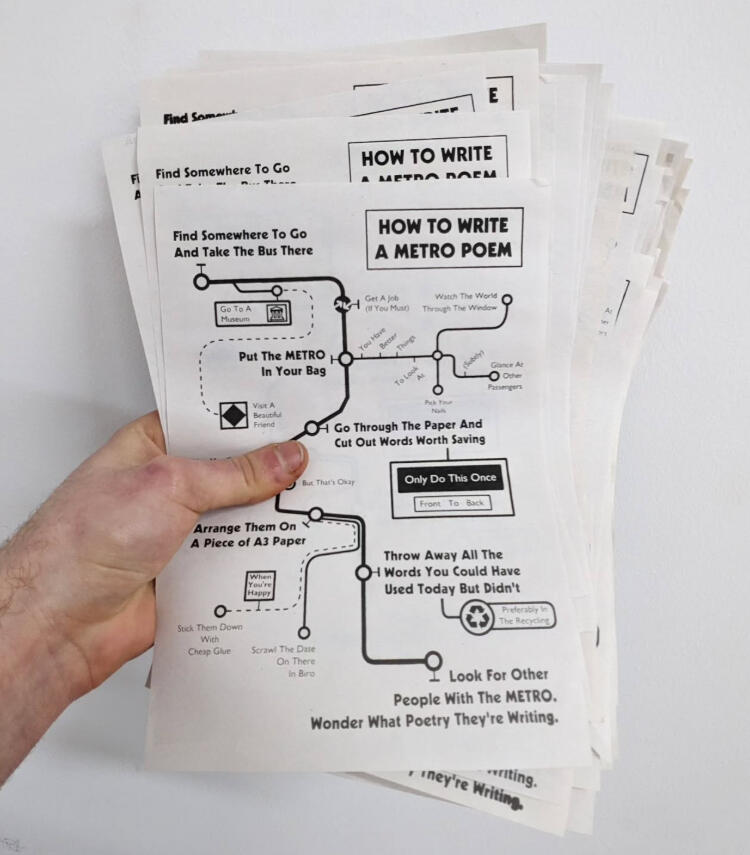
Metro Poetry
collage, screenprint on newsprint and cartridge paper.
Feeling I had left this work somewhat unresolved last semester, I devoted some time to developing my metro poetry and getting it out of the studio. I worked on my screenprinting technique and was able to produce a large volume of my map flyers, which I then distributed on Bee Network buses around manchester. This was documented on my instagram page, letting people know where to look.I was keen not to look for people's responses to the work. Once it left my hands it belonged to the city and they could do what they wanted with it. This is also a way of lifting my anxieties - if i never check then there could be amazing things done with. It could be in the bin. Either way, it's theirs.
[Click to expand images]


Displaying this project in a gallery setting was an interesting process. I provided a selection of my own poetry and a large print for the wall, as well as a stack of metros and some flyers.I was very unhappy with the initial job the curating students did putting my work up (left). It was off-centre, overlapping a gap in the wall; they had skied poems with smaller text, making them illegible; and included ones I had specifically requested be left out. After speaking to the curators so I wouldn't be going behind their back, I rearranged them so that larger text would be higher up and they would better fill the space (right).
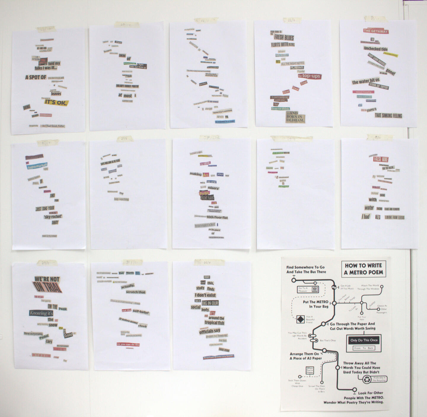
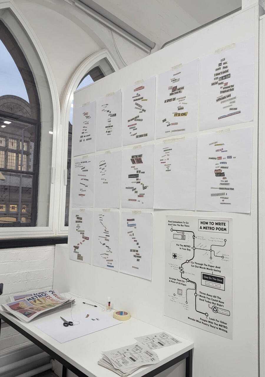
The other part of this display was the desk with flyers and papers. I originally wanted a simple stack of metros and flyers, but ended up included equipment for making a metro poem in the space. I wish I'd stuck to my guns. It was too long and messy an activity to do in the gallery, and what I really loved about the metro poetry project was the anonymity and intimacy. The people who made poems all added their names without fail, which I was a little disappointed by. However, I loved seeing different people's approach to the task, and liked that they added them to the wall alongside mine.
Projects
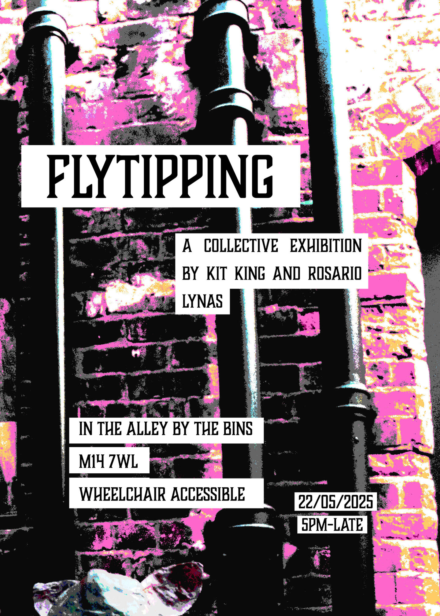
Flytipping
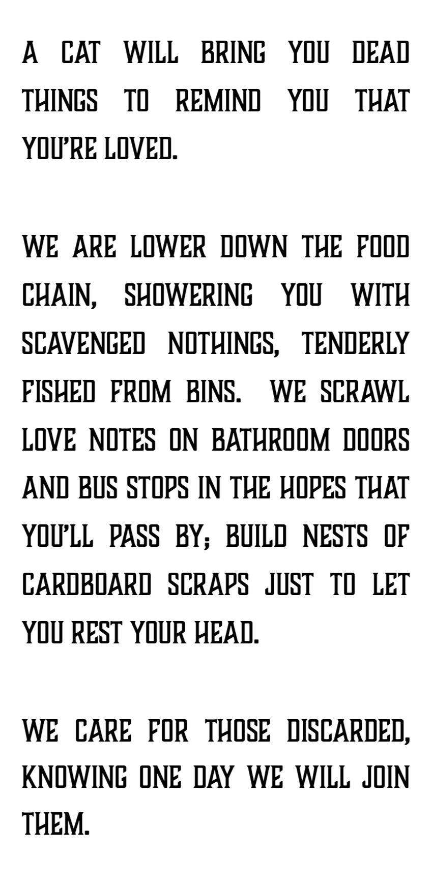
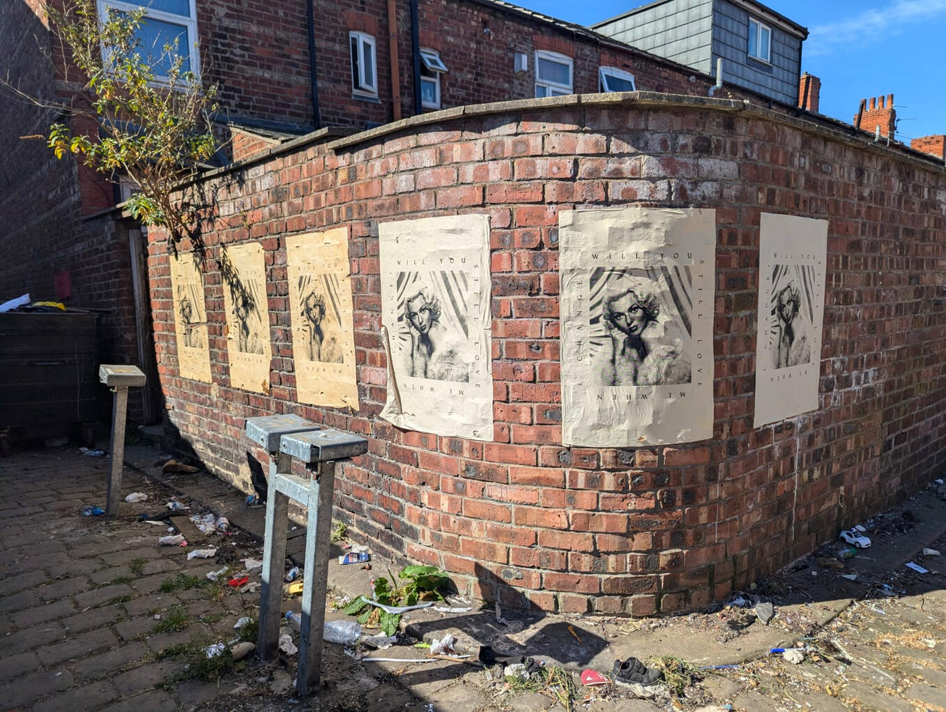
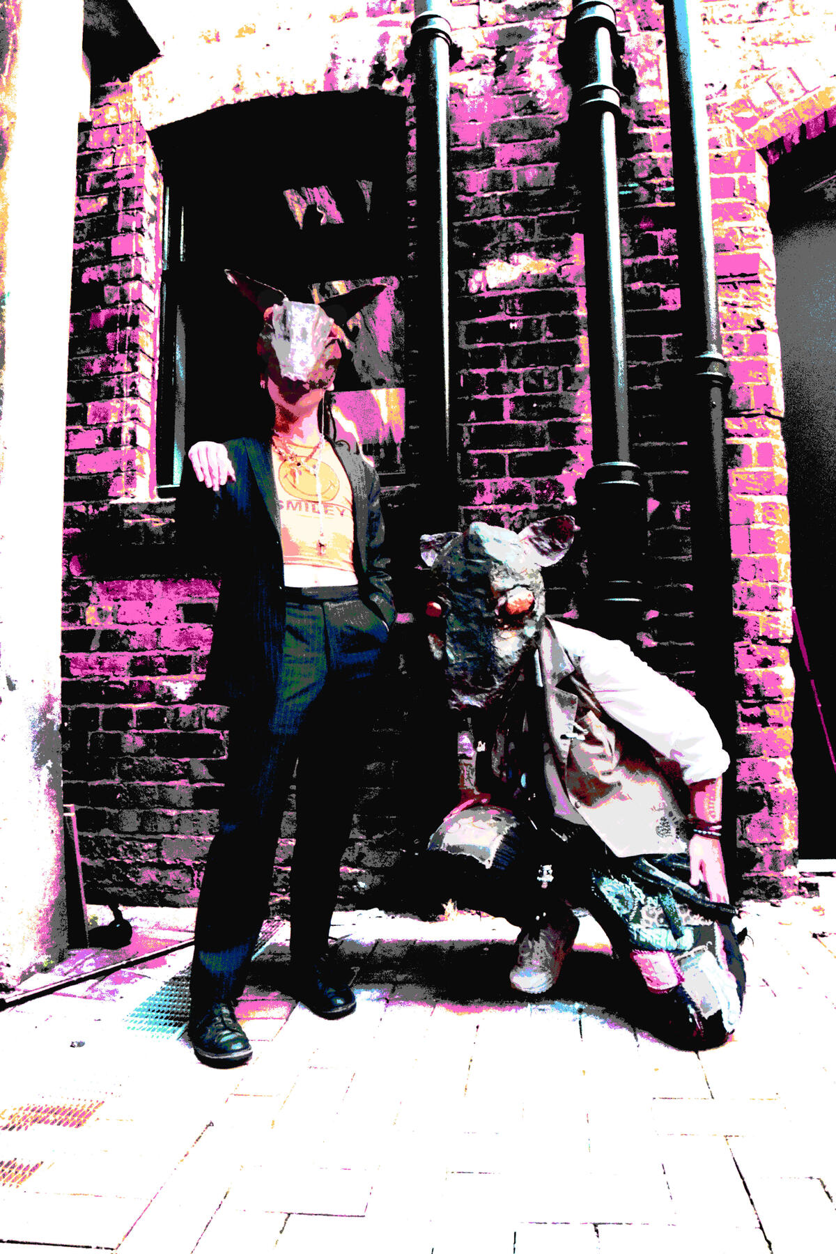
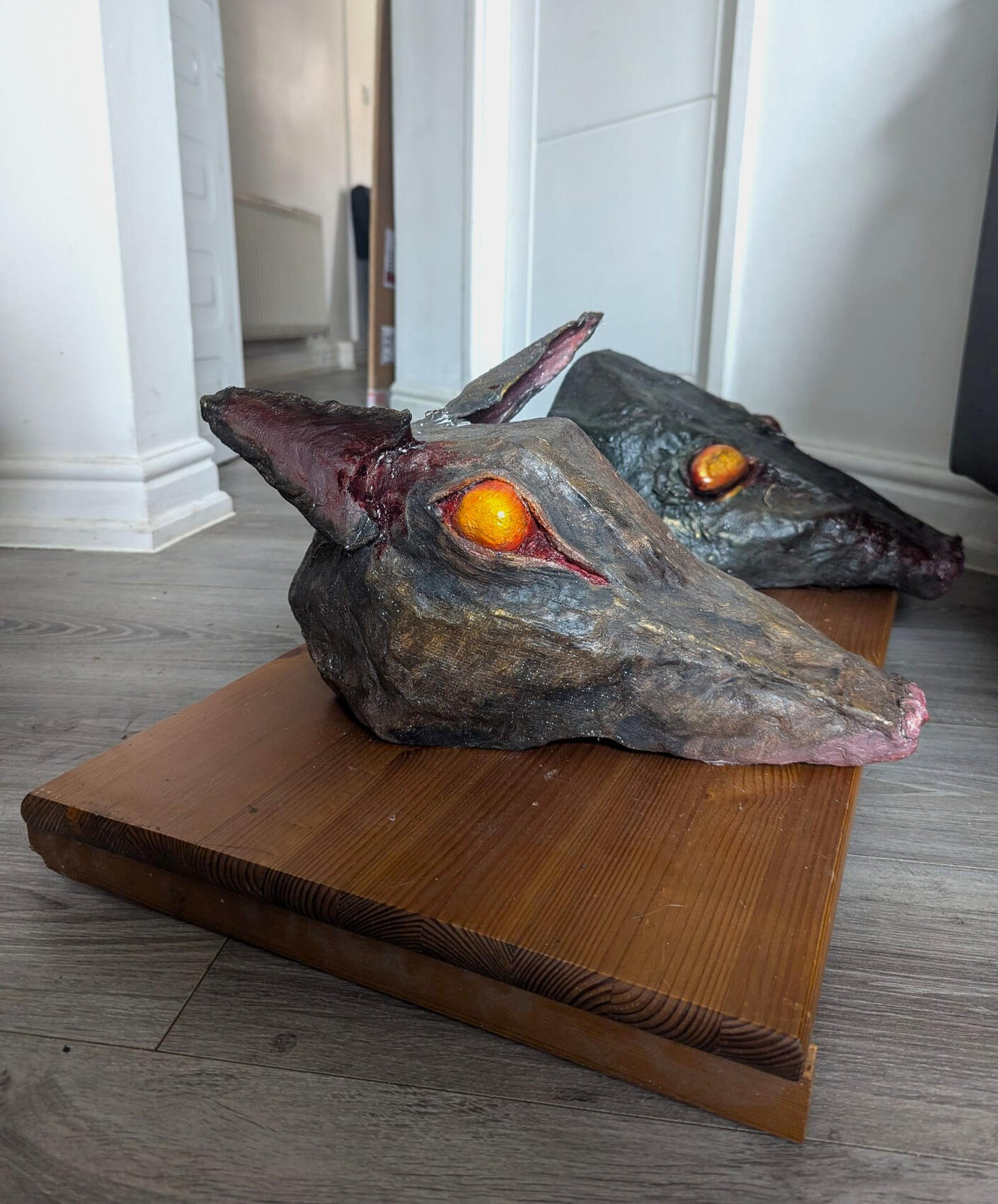
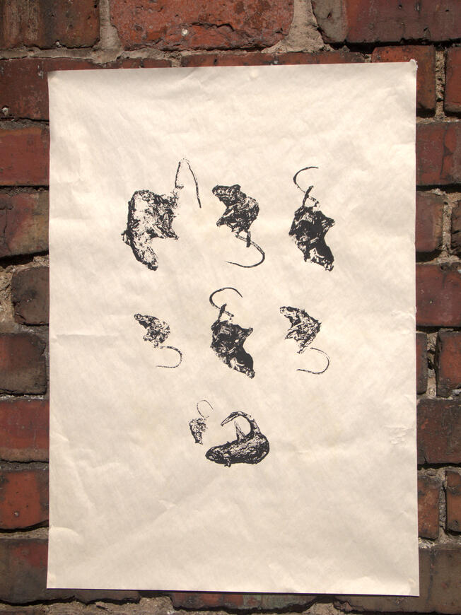
Pop-Up exhibition in public. Produced with Rosario Lynas.In this show we explore the unconventional love and community we have found in the margins of society. This show is an outpouring of love for those discarded by the mainstream, assuring there will always be a place for them here.Working together brought out our shared interests in DIY culture and character. We position ourselves as vermin, constructing much of the exhibition out of materials scavenged from the alley in which it was set.[CW: DEAD ANIMALS]
[Click to expand images]
Event photos


My Works
Ungeziefer
Screenprint on newspaper, A1.
New copies of this print were wheatpasted to the wall every two weeks, resulting in a gradient of weathering and decay.
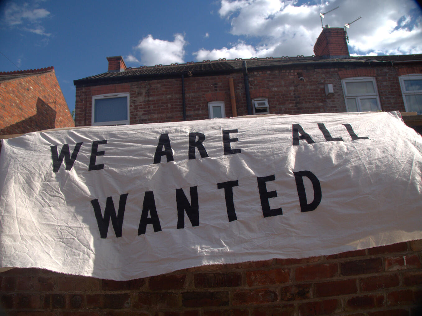
We are All Wanted
Fabric and pine stripwood. 2400 x 1200 mm.
this banner was made in solidarity with the prison population, inspired by a desire to break down the Foucauldian binary of "delinquent" and "normal".
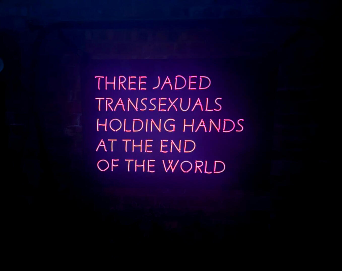
Girls? Girls? Girls?
Sign - Perspex and 5mm electroluminescent wire. 1000 x 600 mm.
Frame - found metal, clamps, and pram clips. 1580 x 1300 mm.
We're The Rats
Inkjet print on silk paper. 1575 x 1092 mm.
hunting trophies
Plaster, cardboard, tin foil, oil paint, ink, and found wood. 1000 x 500 x 200 mm.Plaster masks made for the photoshoot.Me (front) and Ross (back).
Cat Gifts
screenprint on newspaper, A2.Photos edited by Ross, screen designed and printed by me.
studio photos


Projects
Have a vada
Site-specific installation, vinyl.these works form part of an ongoing collaborative relationship with Cass Jones from the Fine art and Art History course. They use the extinct, gay language of Polari to speak directly to the queer viewer, creating a counterpublic within the exhibition.The first, 'Have a Vada', was created for "His/Her/Their stories", the sink gallery exhibition put on with the queer reading group. As the ideals of the exhibition generally aligned with our own, this piece informed the viewer how to interact with our other works and was generally non-confrontational, the polari denoting the intended audience and claiming the space for queer people.The second, 'Trolling the Lavs', was commissioned as part of the vertical gallery to respond to the architecture of the Holden Gallery. This work takes a much more oppositional tone, using the "hiding in plain sight" element of polari to subvert the setting and provide a point of relation and access to the savvy viewer.'Trolling the lavs' will be installed on the 3rd of june. Below are concept images for the installation.
[Click to expand images]
Have a Vada


Trolling the lavs


Trolling the lavs Gallery Text
King and Jones have come together for a second time to work in the historic queer language of Polari. Used by LGBT+ people to communicate safely in more persecuted times, Polari makes use of loanwords and double entendre to obscure its meaning, resulting in a truly subversive and archly humorous counterlanguage. The vinyl phrases around the gallery show a dialogue between the two artists where they cheekily and queerly respond the architectural features of the Holden Gallery; the text blending into the room to evoke the ‘hiding in plain sight’ nature of Polari. It catches the eye of some, winks at many, and is understood only by those in the life.The artists share an interest in language and take play seriously as a way of breaking down the barrier between art and audience. The two have previously collaborated on ‘Have a Vada’ for the exhibition His/Her/Their Stories which similarly used solicitous phrases in Polari to invite queer audiences to engage with work in the space.Kit King is a multidisciplinary word artist with a practice inspired by DIY and maker culture. He is deeply concerned with the decentralisation of art, often working semi-anonymously in public in order to distribute his art directly to the community. His gallery practice serves to question the significance placed on institutions, either by showcasing his public projects or by placing himself in opposition to the space.Cass Jones is an artist and writer working across media including installation, print, still & moving image, drawing and textile to make work about queerness, landscape, history and language. They are interested in the tensions in dichotomies such as intimate/public, political/pop, symbol/referent and metropolitan/rural.You can find Kit @kitkingartist and Cass @studiocassjones on Instagram.
Projects
Mugshots
Kentmere pan 400 35mm on minolta dynax 40, pen on paper.
Inspired by research into mugshots as a genre of portrait photography, this project uses the scientific method of control, dependent, and independent variable to create a series of portraits focusing on the person behind the camera.For every exposure on a roll of film I asked a different person to take my mugshot, holding up a piece of paper with their name and the date on it. The photographers were told to direct me however they wanted, as long as the format remained the same.Some projected their perception of criminals into the work, asking me to look dangerous or remorseful. Others used this as an opportunity to exercise power over me, like the absolutely charming young man who asked me to drool on myself while looking him in the eyes (this was our first meeting).By changing the body language from that expected, this work draws attention to normally overlooked displays of power in the mugshot, which are naturalised by the format.Overall I think this is a weak piece of work. It was an important piece of development, making me realise the more scientific aspects of my approach, but in itself felt shallow. I decided this was an artistic dead end and dropped it after some cursory display experiments.
[Click to expand images]


Projects
How Many More
screenprint, sweat, dirt, coffee, time on A2 cartridge paper.
[Click to expand images]


Though produced last semester alongside a large fabric print in the same series, my friends and I have since been bringing these signs to protests. As they degrade their damage becomes both illustrative of the exhaustion we feel having to continuously fight the same battles and documentation of their use. This reduces the need for repeated photographic evidence of us at protests, a potential security risk.
Research
Exhibitions
2025 – Vertical Gallery Commissions, Holden Gallery, Manchester (upcoming)
2025 – Manchester School of Art Degree Show, Grosvenor Building, Manchester (upcoming)
2025 – ‘Flytipping’, Fly On The Wall, public, Manchester
2025 – ‘His/Her/Their Stories’, Sink Gallery, Manchester
2024 – ‘STRAP UP’, STRAP, Islington Mill, Manchester
2024 – ‘Private Screening’, Manchester Art Gallery, Manchester
2023 – ‘Revival’, West Art Collective, Antwerp Mansion, Manchester
2023 – ‘Unholier Than Thou‘, Latex Sounds and West Art Collective, Antwerp Mansion, Manchester
2023 – ‘SNAP’, Islington Mill, Manchester
2022 – ‘The Look Away Project’, solo exhibition, public and online, Manchester